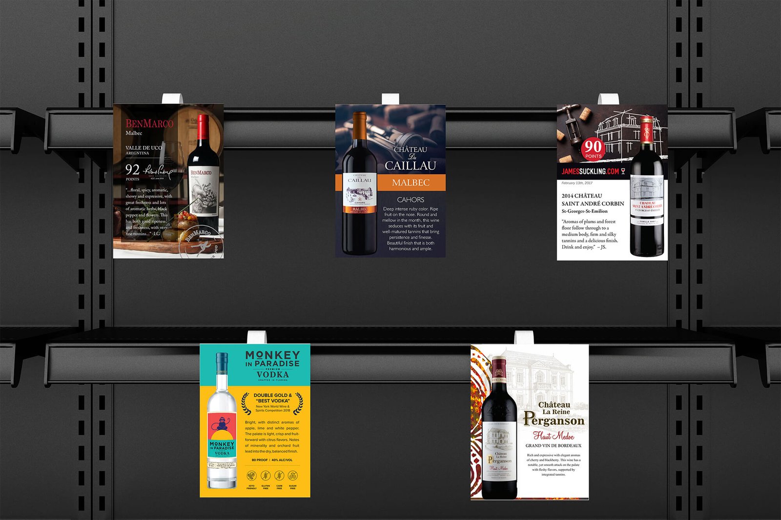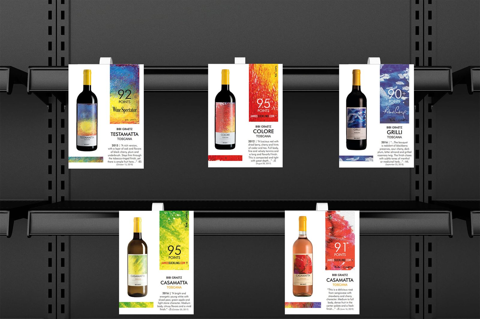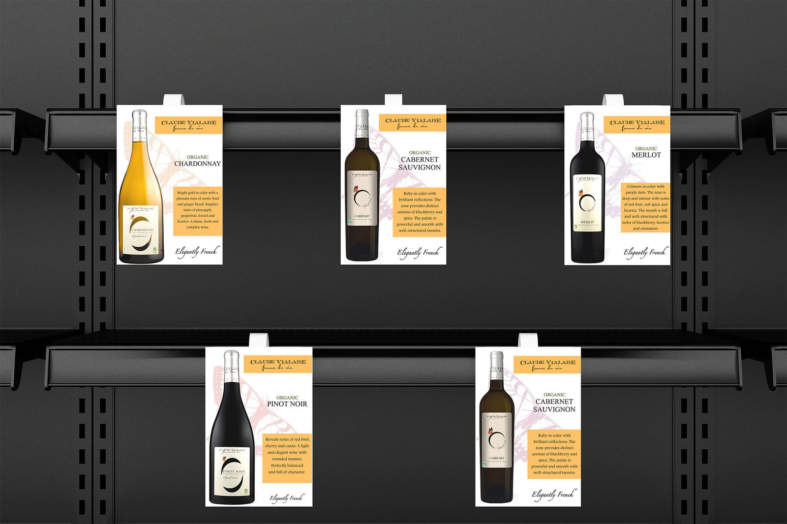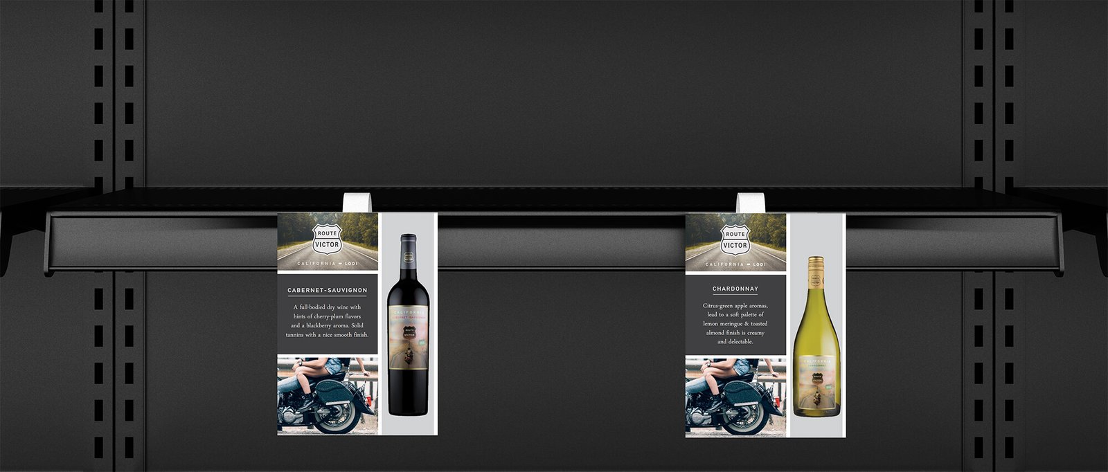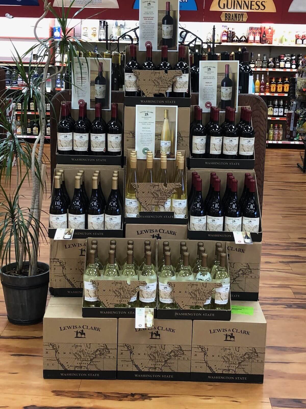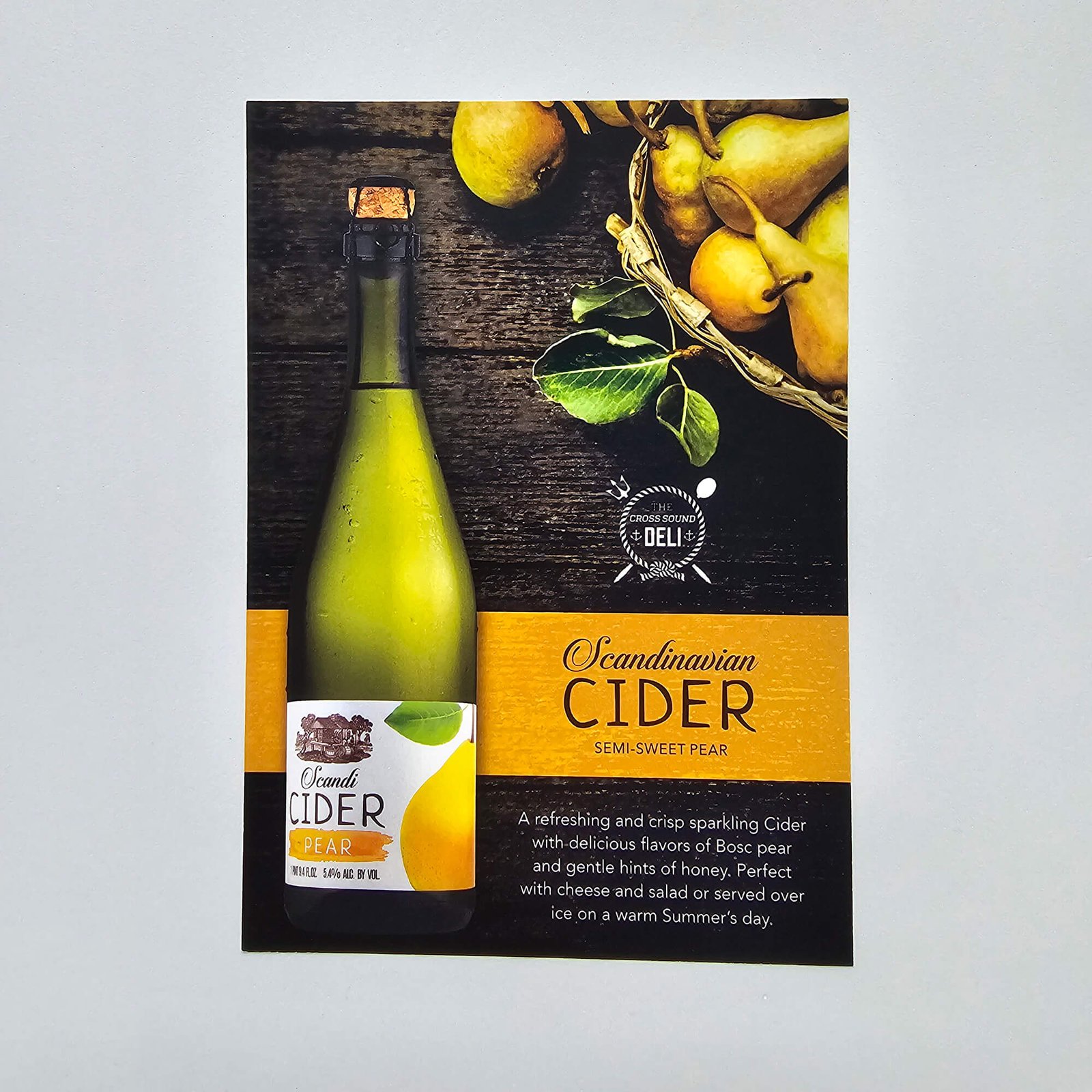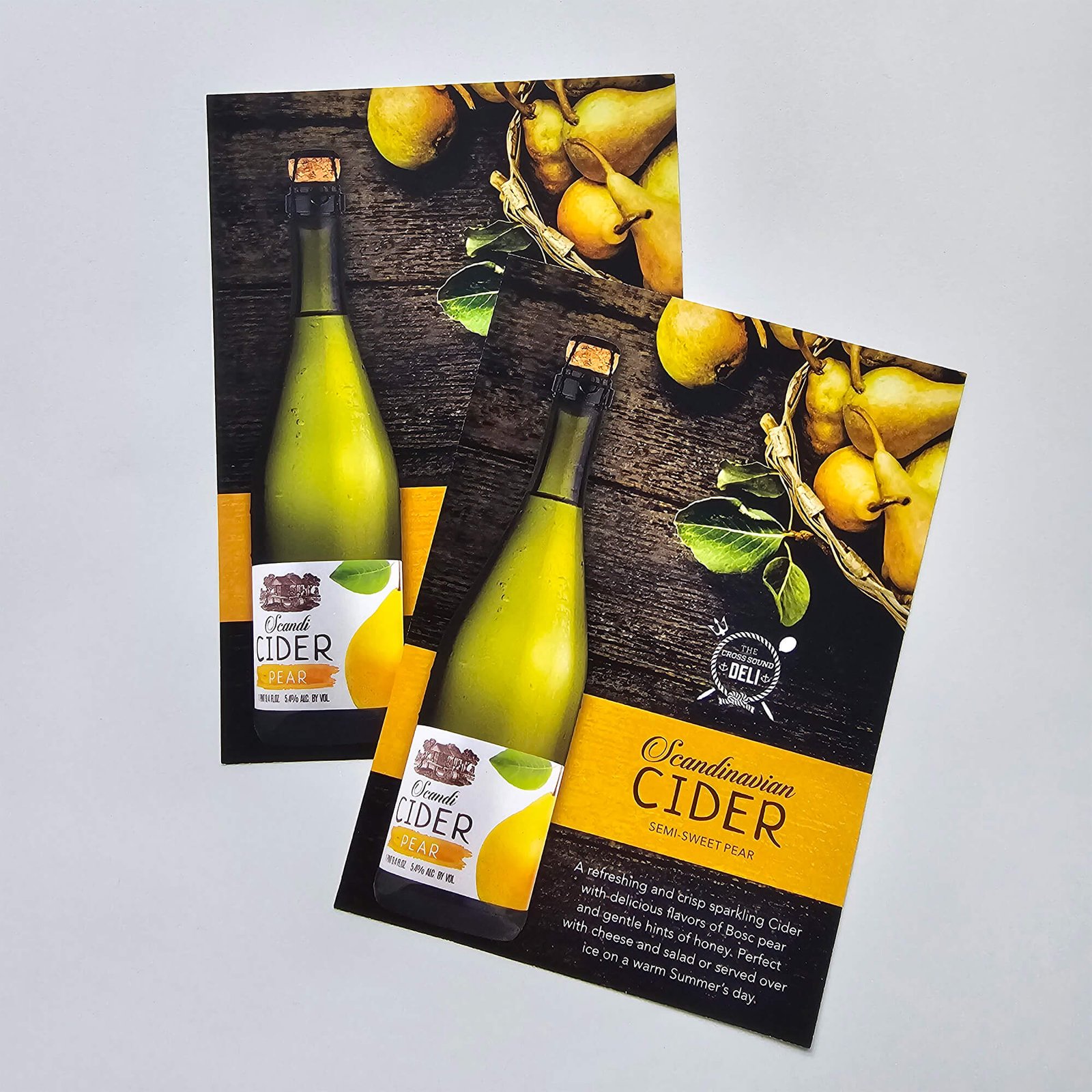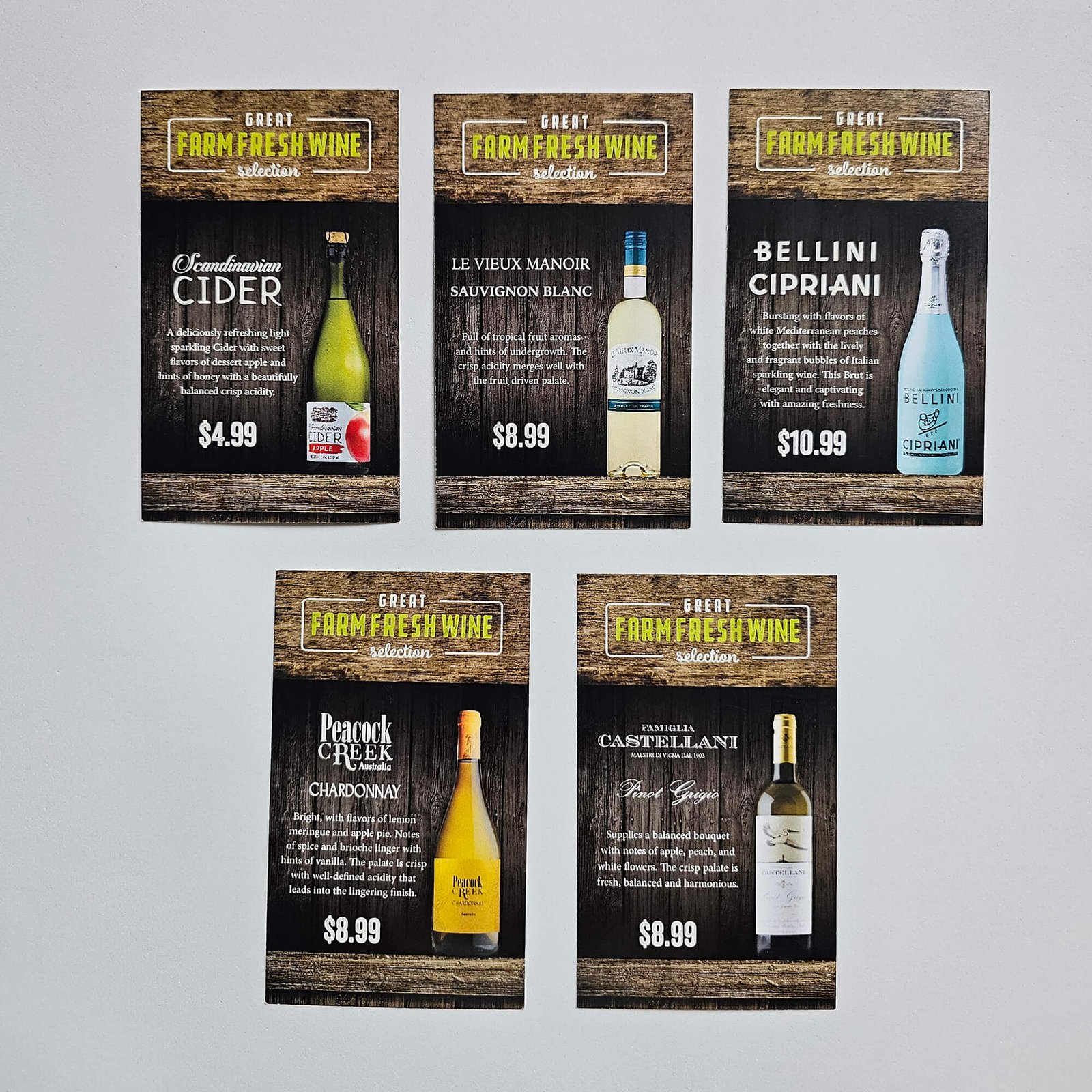


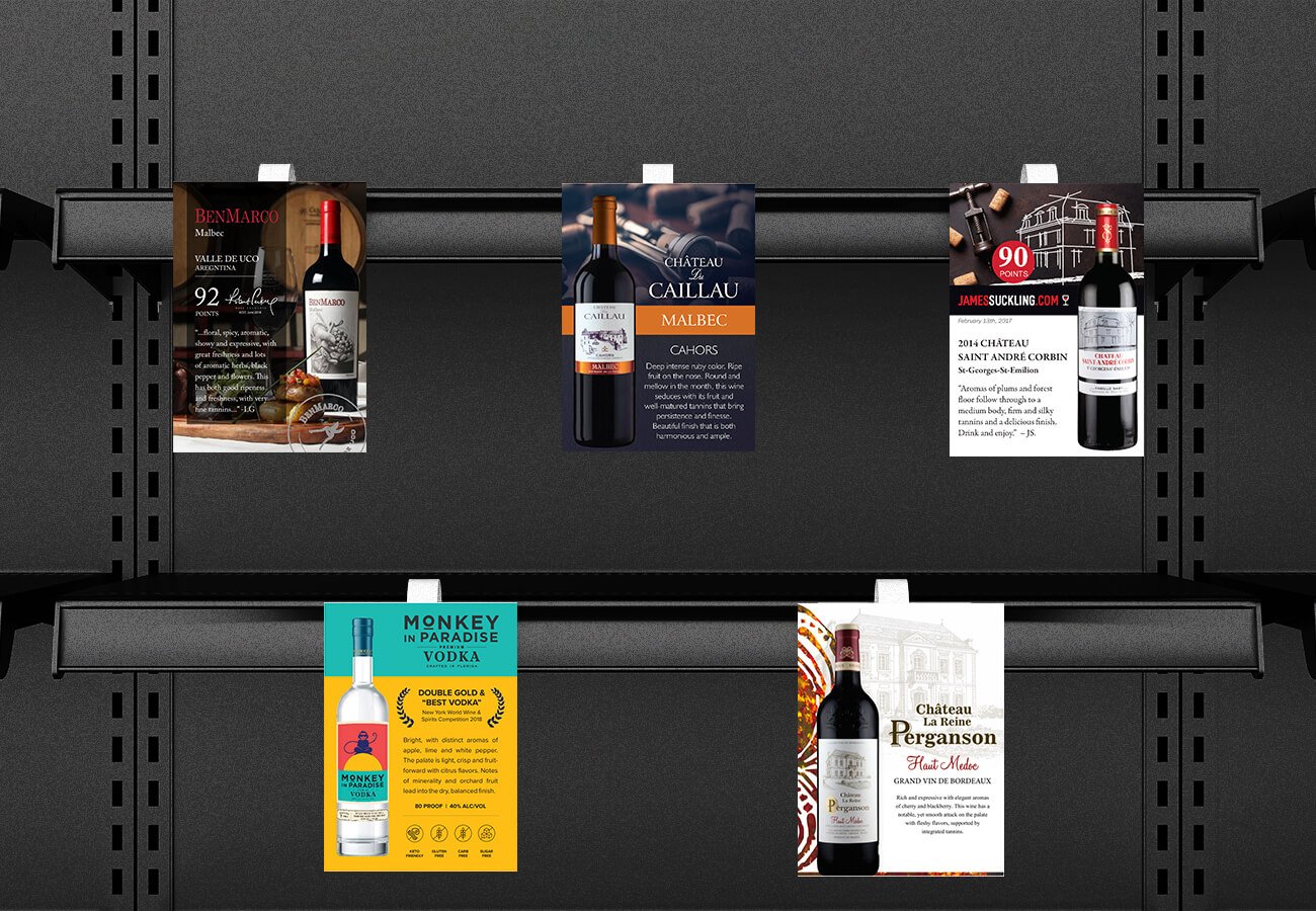


Point-of-sale materials, which we generally just called “shelf talkers,” were an absolute staple in our design queue. Sales reps could order these as standalone items if they just needed standard tags for the retail racks, or they could request them as a complete set. When a rep managed to secure prime floor space for a brand, we offered scaled-up versions to match, specifically producing 8.5″x11″ case cards and larger 12″x18″ laminated signs.
Because this collateral sits right in front of the consumer at the actual point of purchase, the design had to be tight. I tailored every single piece to the specific wine’s original brand identity. We’d pair high-res bottle photography and clean layout techniques with their tasting notes and critical ratings. The goal was always to make sure that whether it was a small shelf talker or a large laminated case card, the brand’s visual aesthetic remained completely cohesive and jumped right off the shelf.
Please click for Slideshow View