




Dynarex is a massive medical wholesale company with 16 distinct product lines, each serving a different market. When you’re dealing with that kind of scale, visual identities can easily become disjointed. My overarching goal was to build a cohesive, modern design system across every single touchpoint; from the physical boxes on the shelf to the digital campaigns that sold them, all while managing the heavy logistical demands of a global medical supplier.
[Infographic of Dynarex umbrella and sub-brands]
Packaging & Global Production
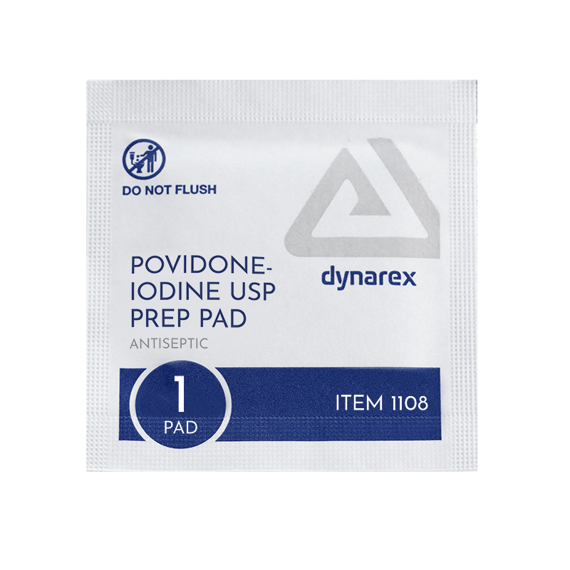
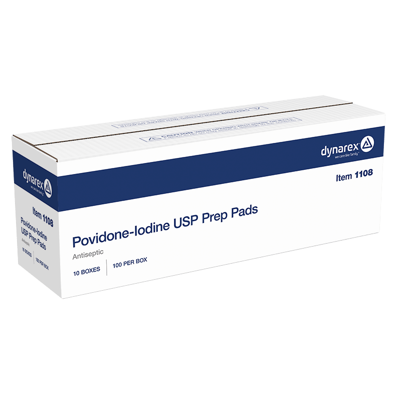
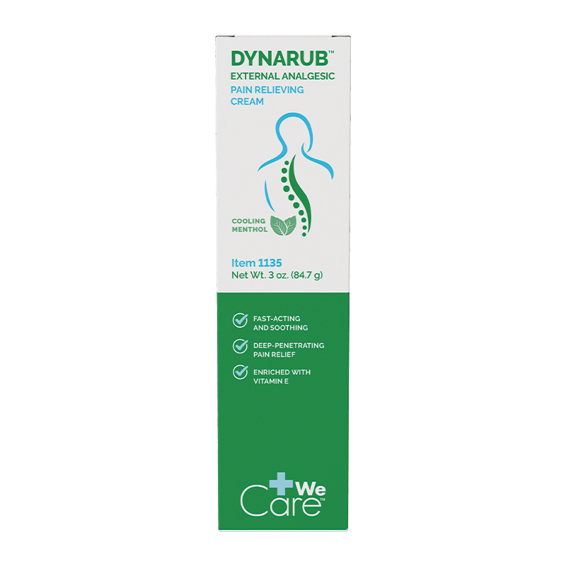
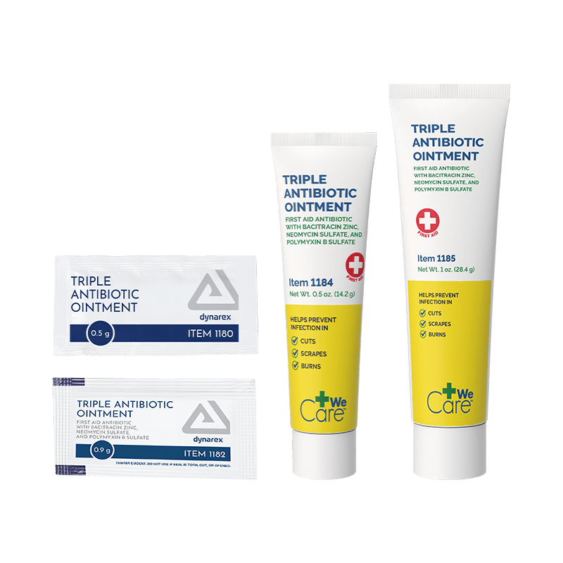
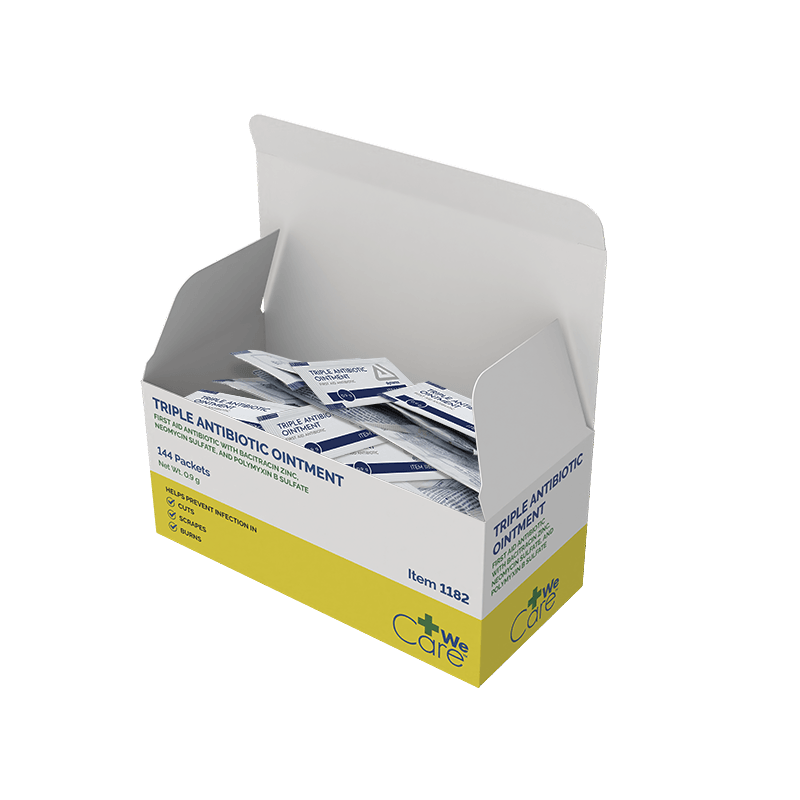
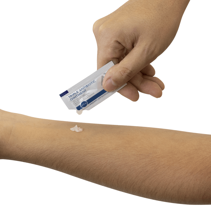
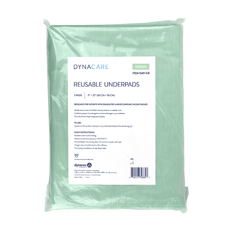
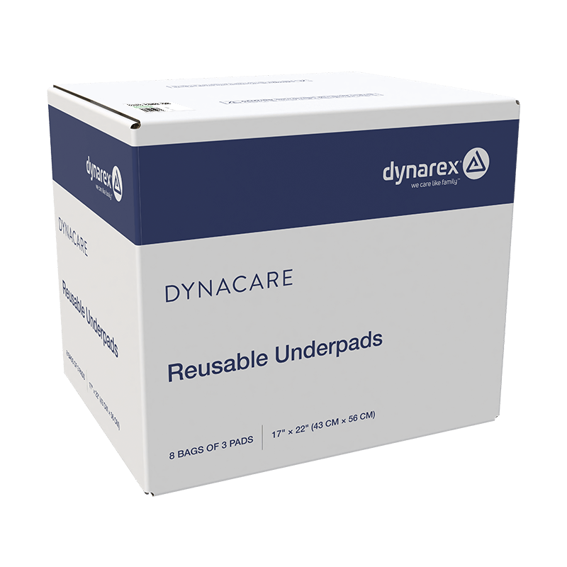
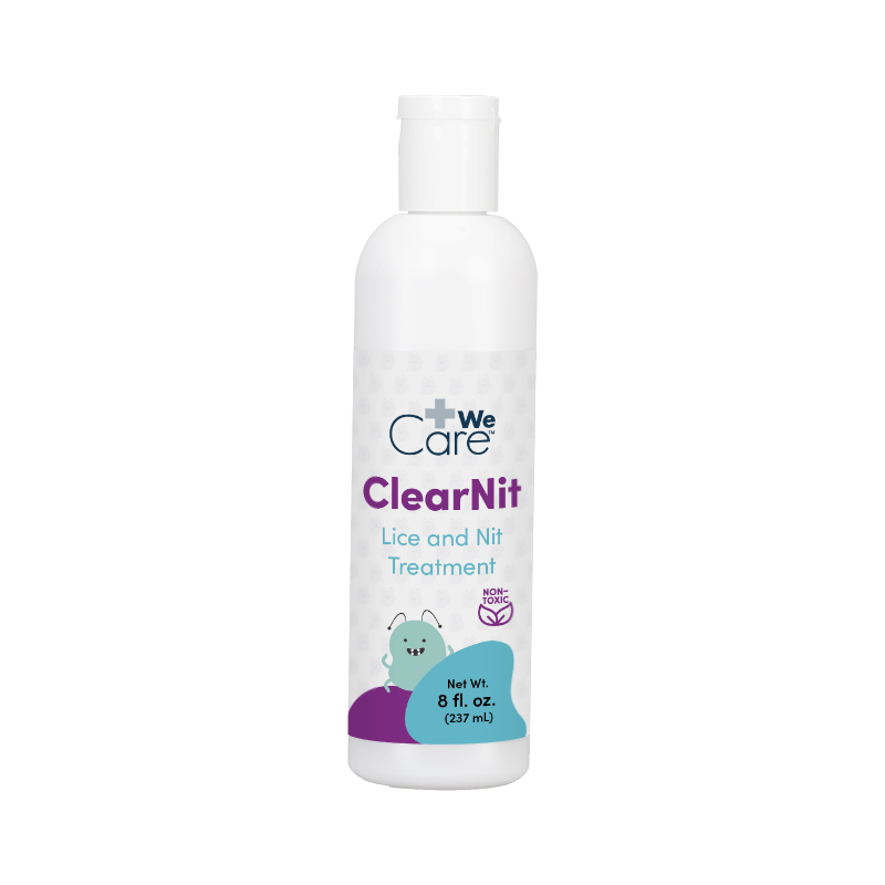
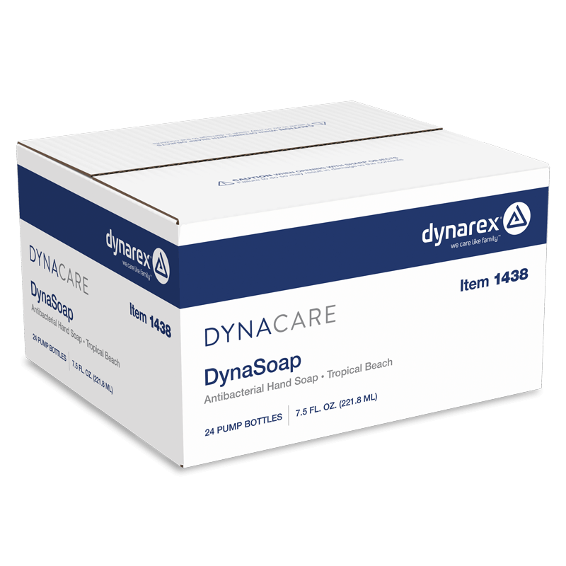
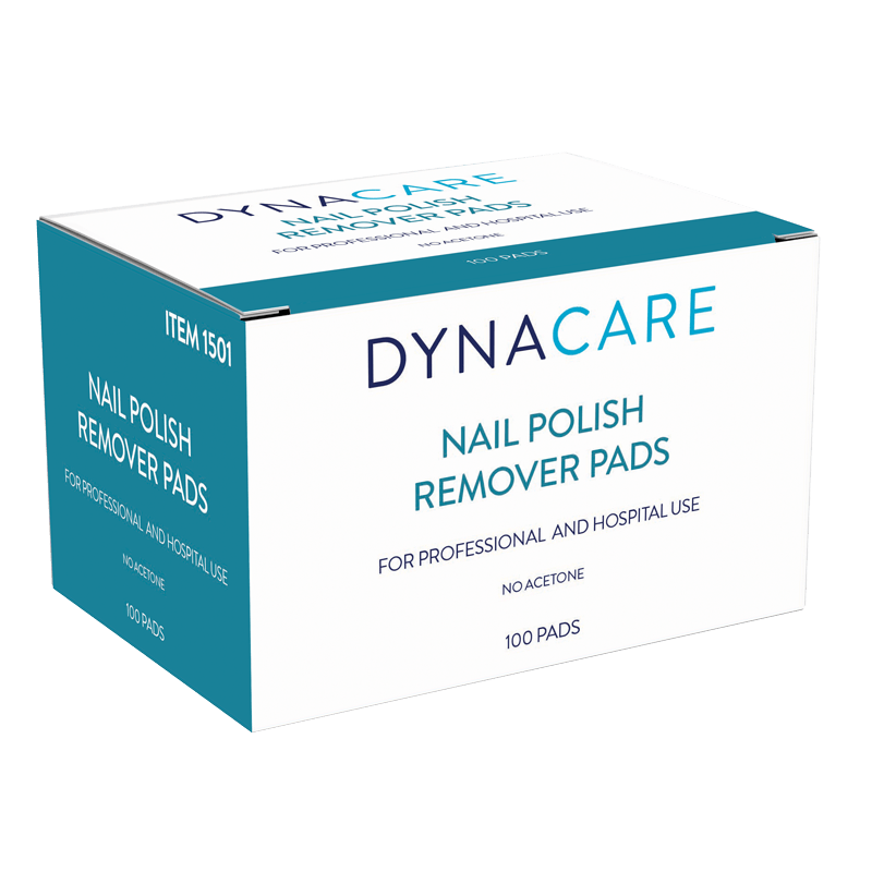
Medical packaging demands absolute precision and strict regulatory compliance. Rather than designing from scratch, my role was focused entirely on production and execution. I took established brand guidelines and pieced together hundreds of complex, print-ready files across wide product lines, making sure every detail stayed consistent and true to the brand system.
Working directly with intricate dielines from manufacturing partners across China, India, and South America, I pieced together multi-tiered packaging suites for every SKU. That meant setting up several distinct files per item: the primary packaging, the retail-ready inner box meant for store shelves or clinic counters, and the heavy-duty master shipping carton built for transit.
I worked closely with our regulatory team to place, scale, and verify critical medical iconography, warning copy, and instructions to keep everything fully compliant and audit-ready. The job came down to technical precision and structural integrity, building rock-solid files that could hold up to overseas mass printing and deliver reliable results every time.
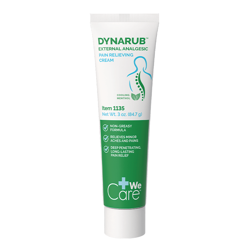





Catalog Design
Catalogs are the absolute lifeblood of a wholesale business. I led the end-to-end design and visual refresh of major multi-page catalogs from scratch, including Barimax, Code Blue, Medicine, and Dynasafety. Medical catalogs have a reputation for being incredibly dense and, frankly, a bit sterile. I wanted to pivot hard away from that. I pushed for a modern, editorial magazine feel, swapping out dingy environmental shots for clean, realistic healthcare settings, while consciously championing racial and gender diversity in our lifestyle photography.
On the technical side, I was often starting with nothing but raw spreadsheets of item numbers. To handle that massive data dump efficiently, I integrated a Salsify automation plugin directly into InDesign. This allowed me to organize specs and charts cleanly, and I completely redesigned the data tables to cut the clutter and make the complex information actually digestible for the end user. It took navigating a lot of stakeholder feedback and late-stage pivots, but we successfully unified the visual language across all the sub-brand books.
[Slideshow of my work]
Sales Enablement & Sell Sheets
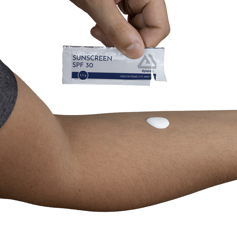
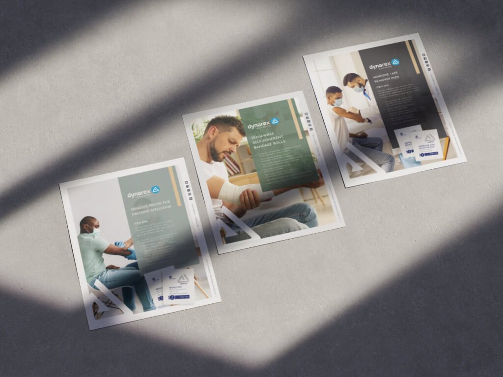
Our sales team needed strong front-line flyers to move products, so I designed the foundational templates for nine different collections and personally built out 90% of the individual item sheets. My main focus here was consistency; taking that elevated, editorial look we established in the catalogs and carrying it directly into the sales collateral. We frequently ran into a major roadblock: a lack of usable product photography. To keep things moving, I got scrappy. I stepped in as a hand model, shot my own custom photography, built complex photo composites, and leaned into AI tools to generate highly realistic, in-use lifestyle environments for the products.
Social Media & Digital Storytelling
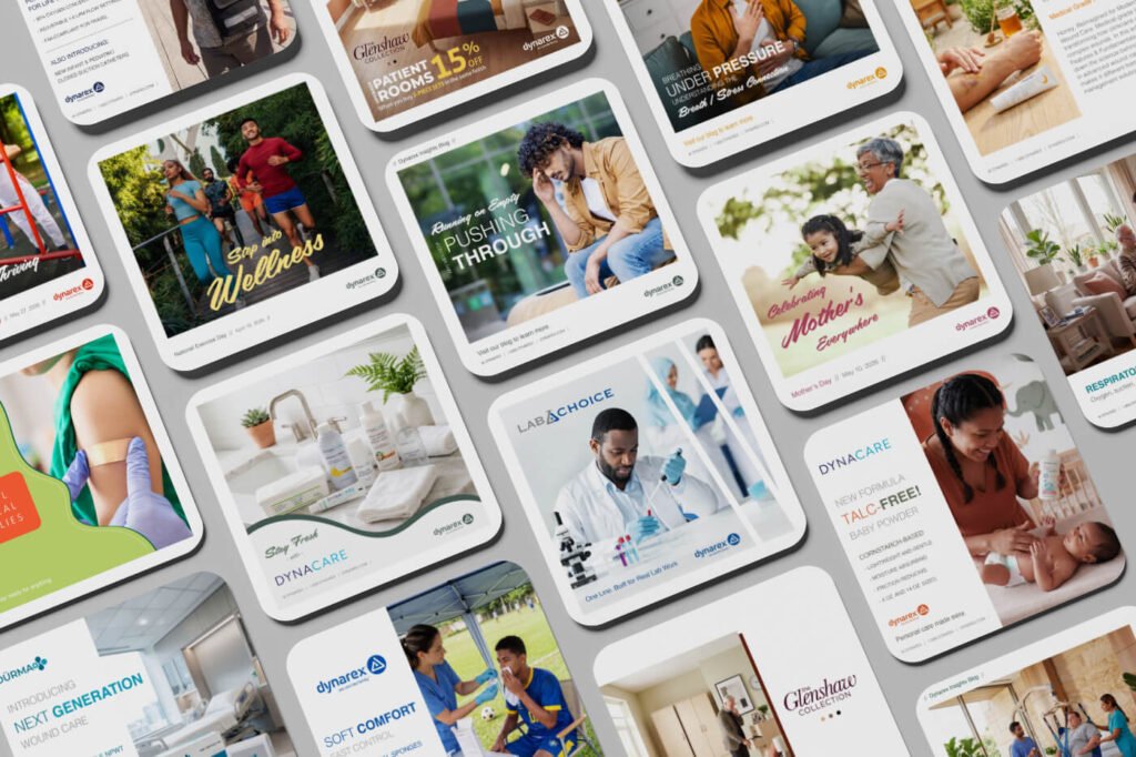
When the content team came to me looking to refresh the social media posts for their blogs, I saw an opportunity to do more than just update a few graphics. We were dealing with inconsistent visuals and a lack of clear hierarchy, plus we rarely had good, real-world photos of our products actually being used. I built out a flexible, clean template system covering all of their daily needs. To solve the photography gap, I used a mix of stock and AI generation to build vibrant, inclusive scenes that captured real motion and emotion. Those templates are still in active use today, and that shift in our visual storytelling genuinely moved the needle on our follower counts and overall blog traffic.
Email, Advertising, and Everything In Between
To streamline our digital marketing pipeline and take the pressure off the design queue, I designed a suite of custom email layouts in Pardot. I built seven distinct, foolproof templates that allowed our copywriting team to easily swap in content without breaking the brand’s visual integrity. Beyond the core collateral, I jumped in wherever the creative need was; designing custom digital ads for medical platforms, co-branded vendor advertising, large-scale end-cap displays for physical retail, and both internal and external event marketing materials.